How We Can Help You With Photos
There is a difference between taking an amazing photograph and being able to use that photo in a way you wanted. Lets talk about the difference and how we can help you, so your photo comes out looking the way you intended it to. First off there are two different types of photos and we need to be clear on the differences between them.
Raster
Explained
The Issues
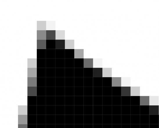
The higher the pixel density, the smaller the boxes and the more the image can be enlarged before it becomes distorted. This distortion comes from the fact that as the picture increases in size so does the number of colored boxes required to make the image. The problem is the computer docent have any information on what color these new extra boxes should be, so it does its best to guess. This can cause problems, commonly referred to as a picture becoming pixilated or low resolution. If you look at a straight line or curve in Raster format, it is actually made up of three different colors. This makes it hard to print a logo using a Raster format.


The Pros
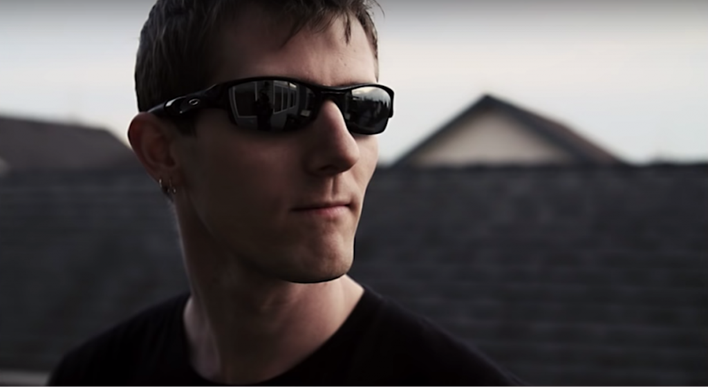
Raster formats are really great for capturing detailed images that might need those subtle changes to really have the image look lifelike. Your face and skin tone are made up of many shapes, curves and slight changes in pigment. These slight changes are better captured by a Raster image than by something with a hard line such as a Vector image.

Vector
The Pros
Vector images are great for logos or any image that might be used in several different places. Because they can be shrunk down to fit on a business card and blown up to fit on a highway billboard. Like we mentioned before this is because the image is made up of a collection of nodes that have a defined X and Y Axis. This node will have information on what stroke, color, shape, curve, thickness, and fill to use to get to the next node. So if the space between the nodes is shrunk down or expanded it doesn’t matter. Also for any image that needs sharp clearly defined lines, it’s best to go with a Vector format.
Explained
If you have ever seen detailed illustrative work, industrial illustration or a companies logos, they are most likely Vector Images. PDF, EPS, and AI are all file formats that save images in Vector Formats. Every Vector image is a mixture of lines, curves, and edges. Each line or curve runs through control points or nodes, and these points are assigned an X and Y axis location on the grid. Each of these points has a definite position on the x- and y-axes of the work plane and determines the direction of the path; further, each path may be assigned various attributes, including such values as stroke color, shape, curve, thickness, and fill. Because of this, the images size can be adjusted without affecting the image.

The Issues
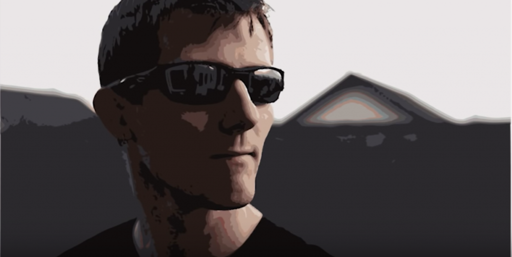
Vector images have clear, sharp lines, where one thing begins, and the last things end. Some images are designed this way, such as letters in the English language. However, other images have more subtle transition points such as the human face. Using sharp lines on a subtle transition image can cause the image to look distorted or cartoonish.


